Type
Sofascore Sans
01
Sofascore Sans is our typeface. A sans that embodies the precision, technicality and of Sofascore’s nature.
DOWNLOAD
Our full set consists of a primary sans, complementary mono and a lighter regular weight.
SOFASCORE SANS BOLD
ABCDEFGHIJKLMNOPQRSTUVWXYZ
ABCDEFGHIJKLMNOPQRSTUVWXYZ
0123456789
Using only in bold allows us to create a distinct seamless style that removes any visual typographic noise.
SOFASCORE MONO
ABCDEFGHIJKLMNOPQRSTUVWXYZ
0123456789
The monospaced version of Sofa complements the bold with it’s functional nature. Working the hardest in the family to allow legibility at those smaller sizes.
Always use Sofa Mono in all caps.
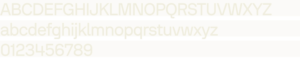
SOFASCORE REGULAR
ABCDEFGHIJKLMNOPQRSTUVWXYZ
ABCDEFGHIJKLMNOPQRSTUVWXYZ
0123456789
The regular weight of Sofa is added for future-proofing extra flexibility but should only be used when really needed.
SOFASCORE BOLD
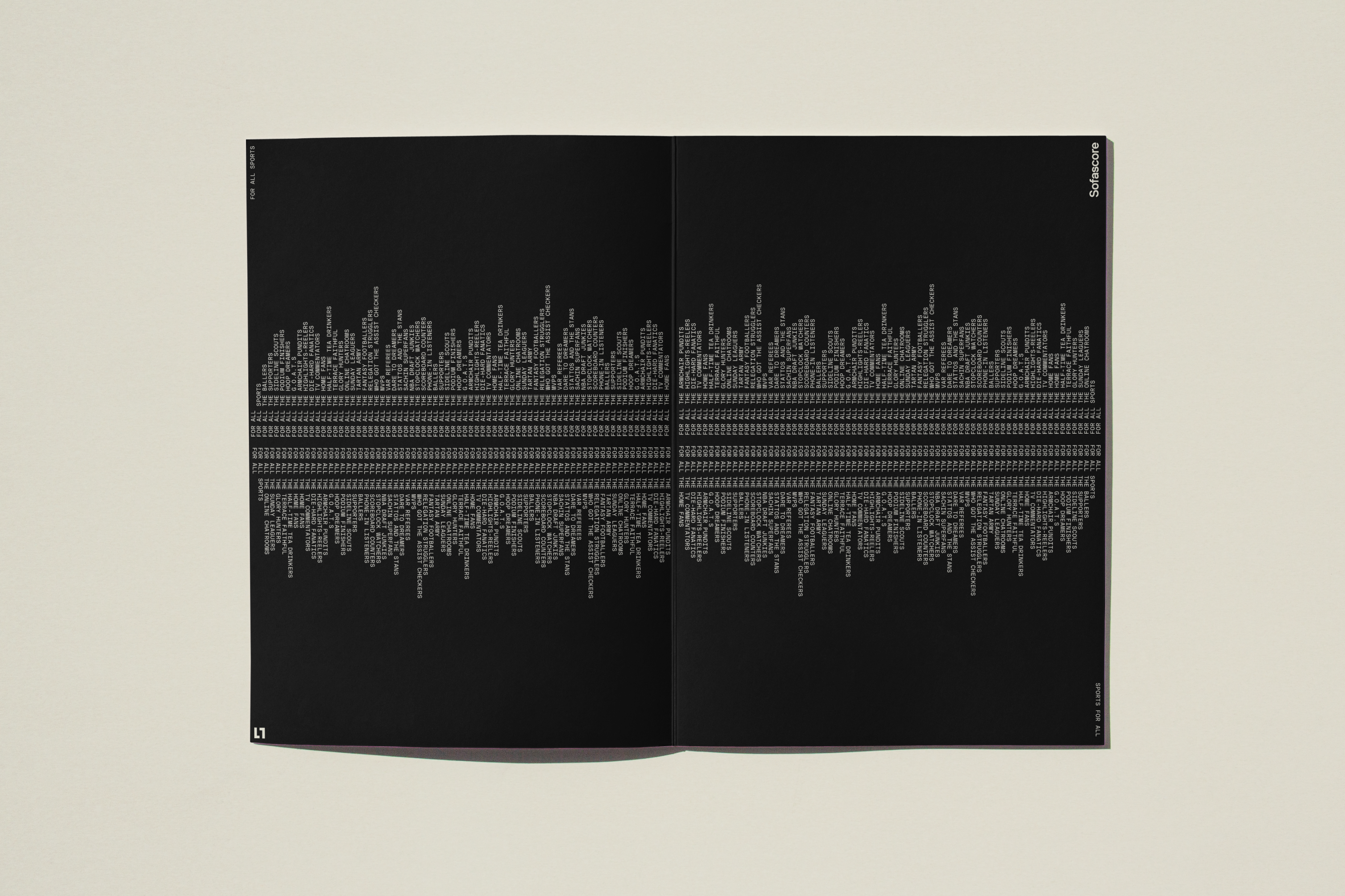
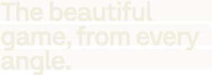
All sports,
all together, right here, right now.
DISPLAY / HEADLINE
FIGMA: -3%
ADOBE” -30PT
WEB: -0.03EM
SOFASCORE MONO
FOR ALL SPORTS / SPORTS FOR ALL
FUNCTIONAL
Figma: -2%
ADOBE: -20PT
WEB: -0.02EM
SOFASCORE REGULAR
Two times Tour de France winner, Giro silver in 2014.
EXTRA
Figma: -3%
ADOBE: -30PT
WEB: -0.03EM
Line-height
Line-height is the space between baselines and determines legibility and readibility as well as impacting the strength of voice.
Refer to these settings in order to create bold compositions whilst maintaining a level of legibility.
SOFASCORE BOLD
DISPLAY / HEADLINE
93.33%
SOFASCORE MONO
![]()
FUNCTIONAL
100%
SOFASCORE REGULAR
EXTRA
120%
Hierarchy
02
Our hierarchy is created through the use of size and position. Common hierarchies used are combining the Sofa Bold and Mono fonts.
