Illustration
Style
01
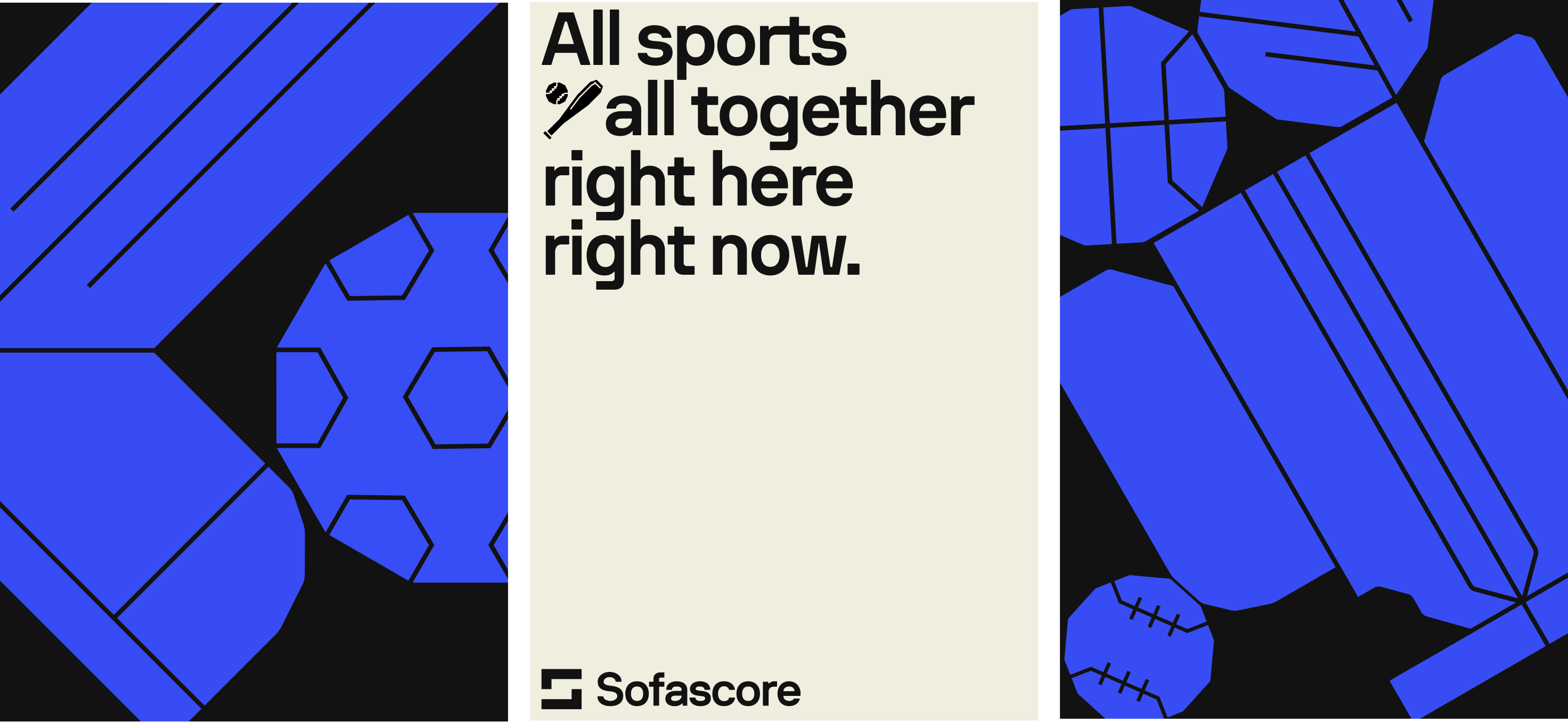
Our illustrations bring a more humanistic and playful feel to our brand. They are still created with precision and accuracy so have a grided geometric feel.
Graphic
They should feel bold and graphic so they be punchy and exciting when used at a larger, but still carry that power when used small.

Build
When creating illustrations, keep them on a geomtric grid which will allow you to easily draw simple shapes and forms, whilst staying accurate and precise. Our illustration style starts with a strong fill which should always be in the form of our primary palette.

Flat
The corners should have a slightly rounded edge to feel coherent and consistent with our icons and typography. The details withing the illustrations should be created with stroke lines, which should always be a consistent weight throughout the illustration.

Moodboard
02
Below shows a moodboard of some found refereces which allign to our style and illustratoin principles. Refer back to these when looking to be inspired to create more illustrations.
reference

Dimension
03
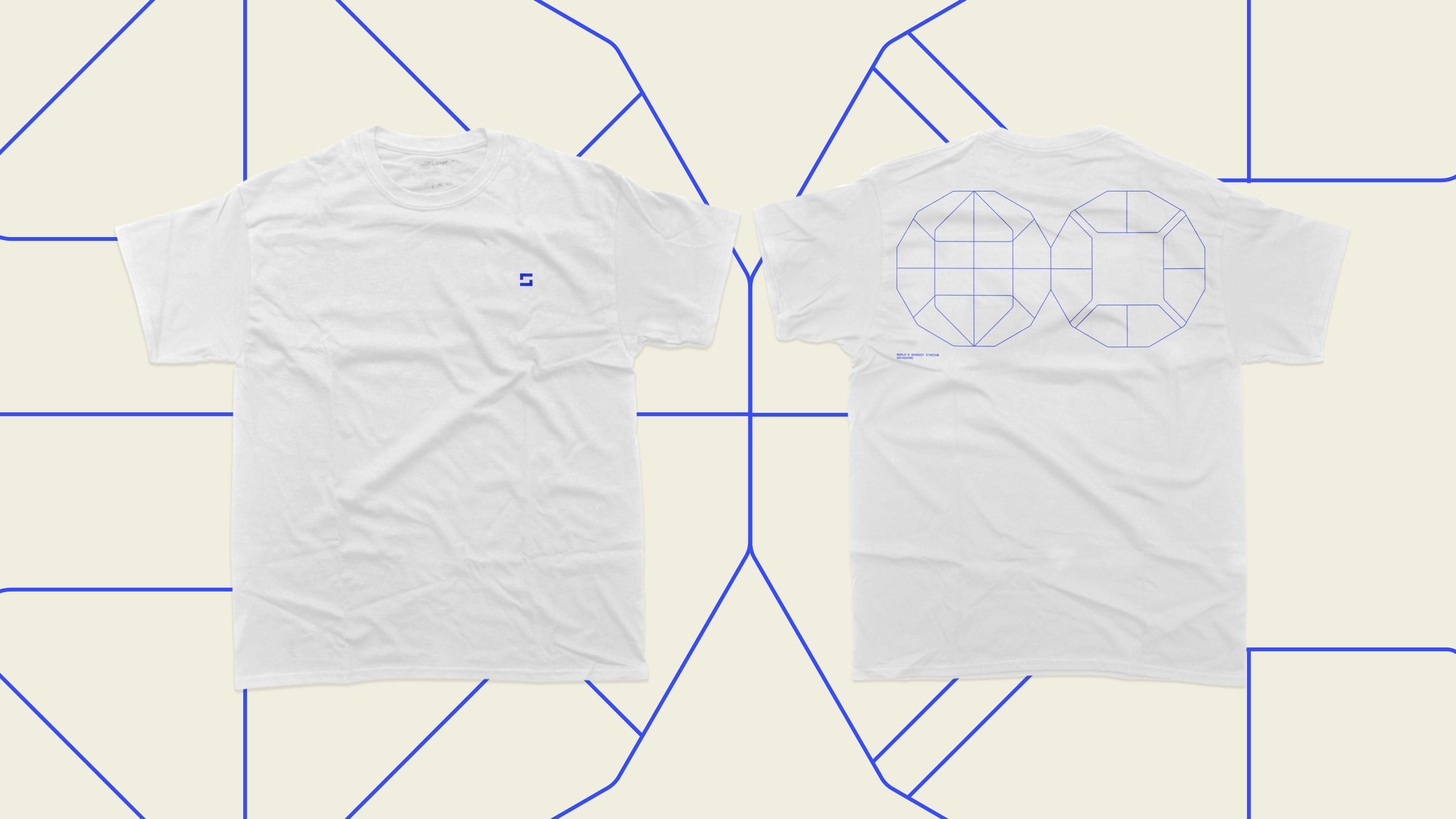
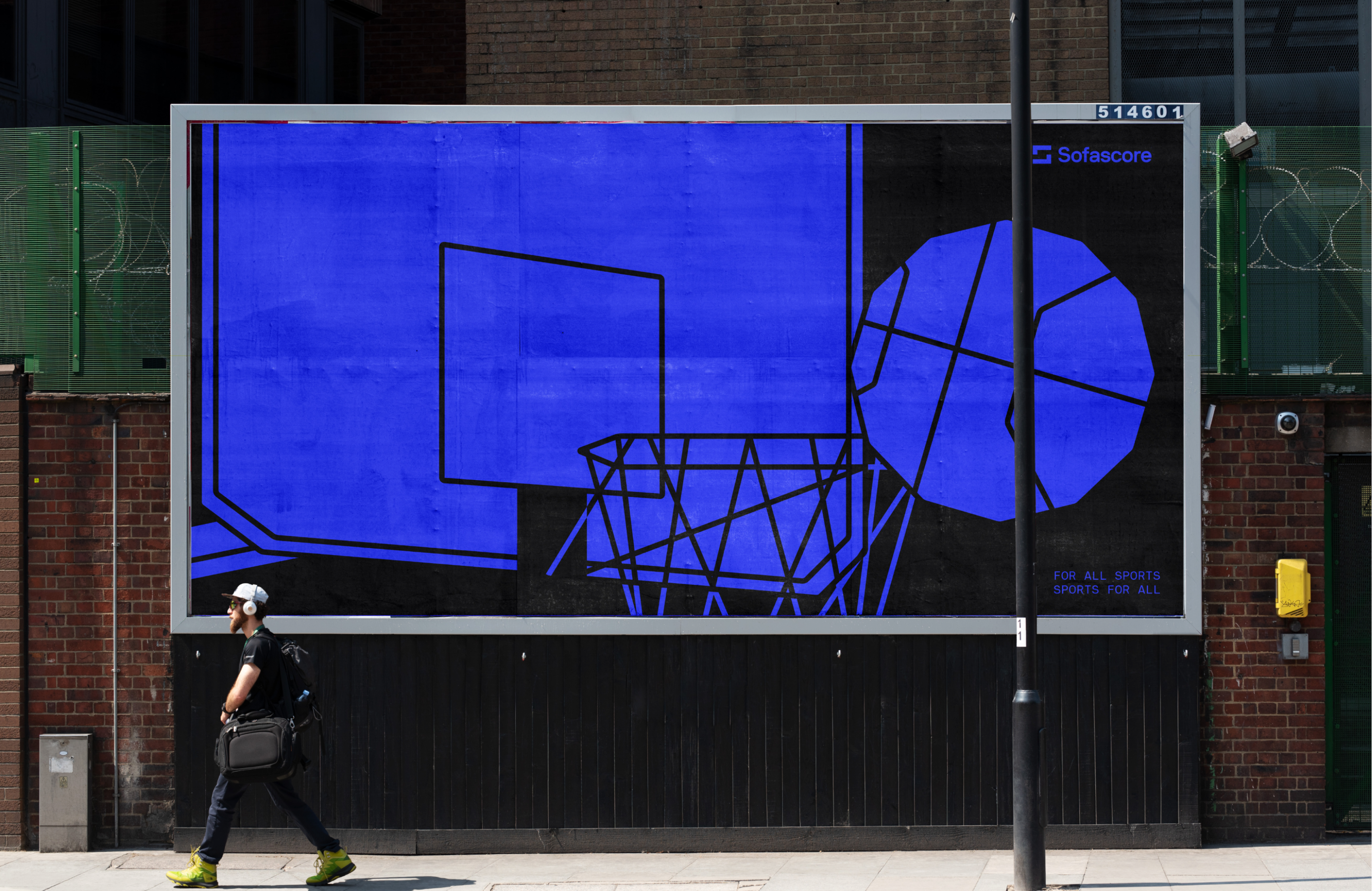
Adding dimension to our illustrations can help us create more dynamic and exciting pieces.
Dimension
We elevate our illustrations by adding dimension to them. We can do this by skewing the them to create a sense of depth and dynamism.
Different components should be alligned. And to further crete contrast and continuity – inverese strokes when overlapping filled shapes with the same colour.

Examples
This is how we can use illustration across our brand applications .