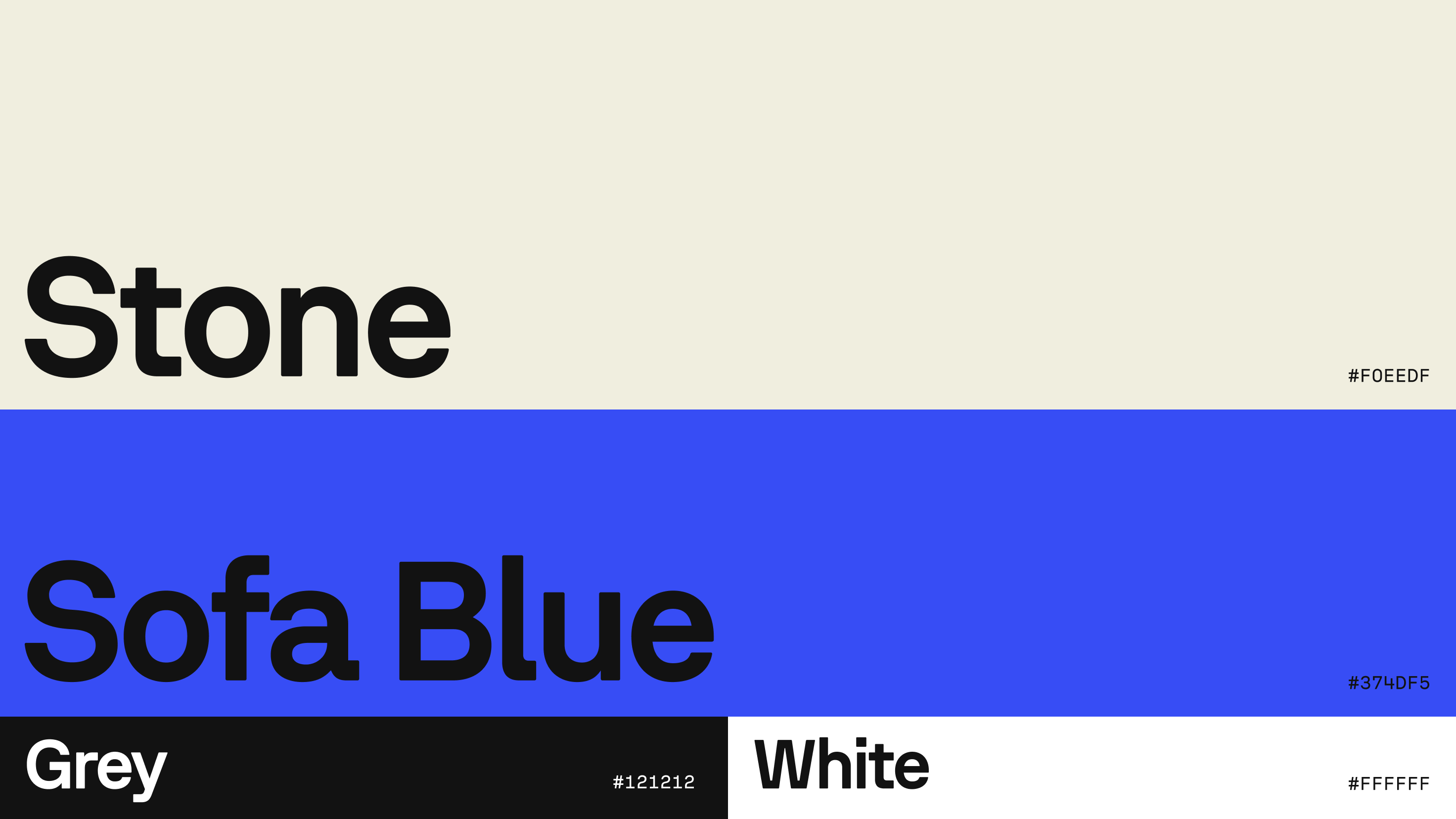
Colour

01
Our colour palette strikes a sense of balance between the two Sofascore worlds, tech and human.
DOWNLOAD
Our primary accent Sofa Blue reflects our tech data nature and it’s contrasted with a stone and softer grey to provide a sense of calmness and humanity.
In order to keep the vibrancy and contrast of the brand in print, please use exclusively Stone, Grey or White. Only use blue for print if using spot colour printing method.
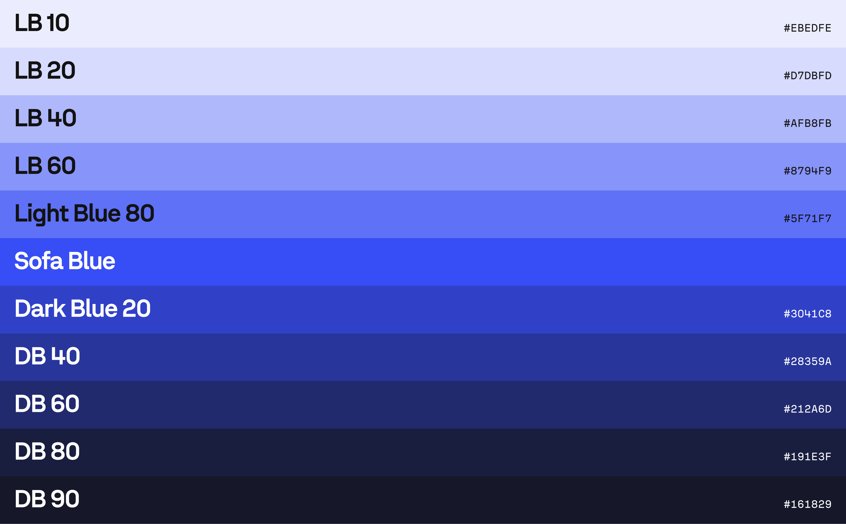
Secondary
02
Shades of Sofa Blue add a layer of versatility when grey, stone and blue aren’t sufficient such as graphics, UI elements and component states.
DOWNLOAD
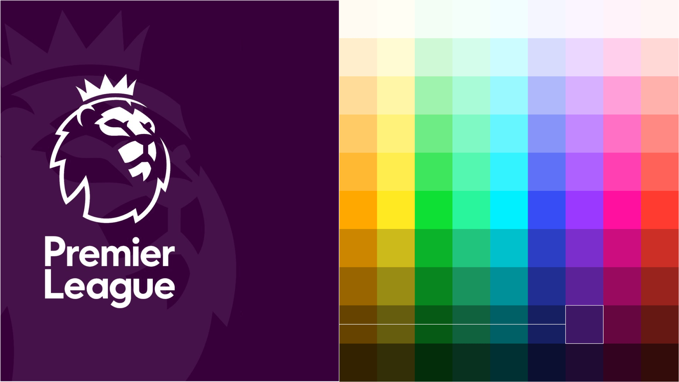
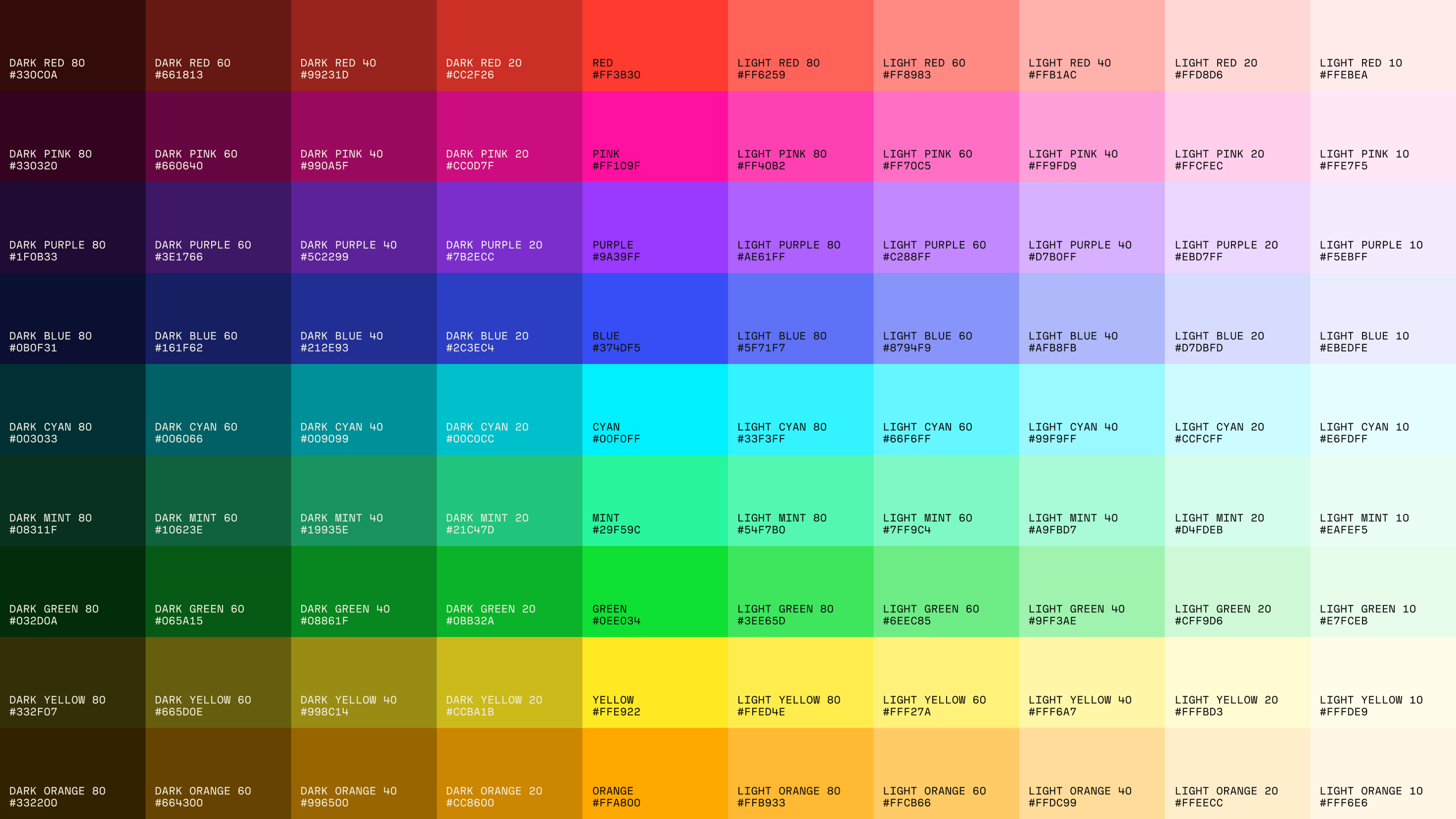
Tertiary
03
Our tertiary palette is composed by a wide range of colours that match the vibrancy of the Sofa Blue.
DOWNLOAD
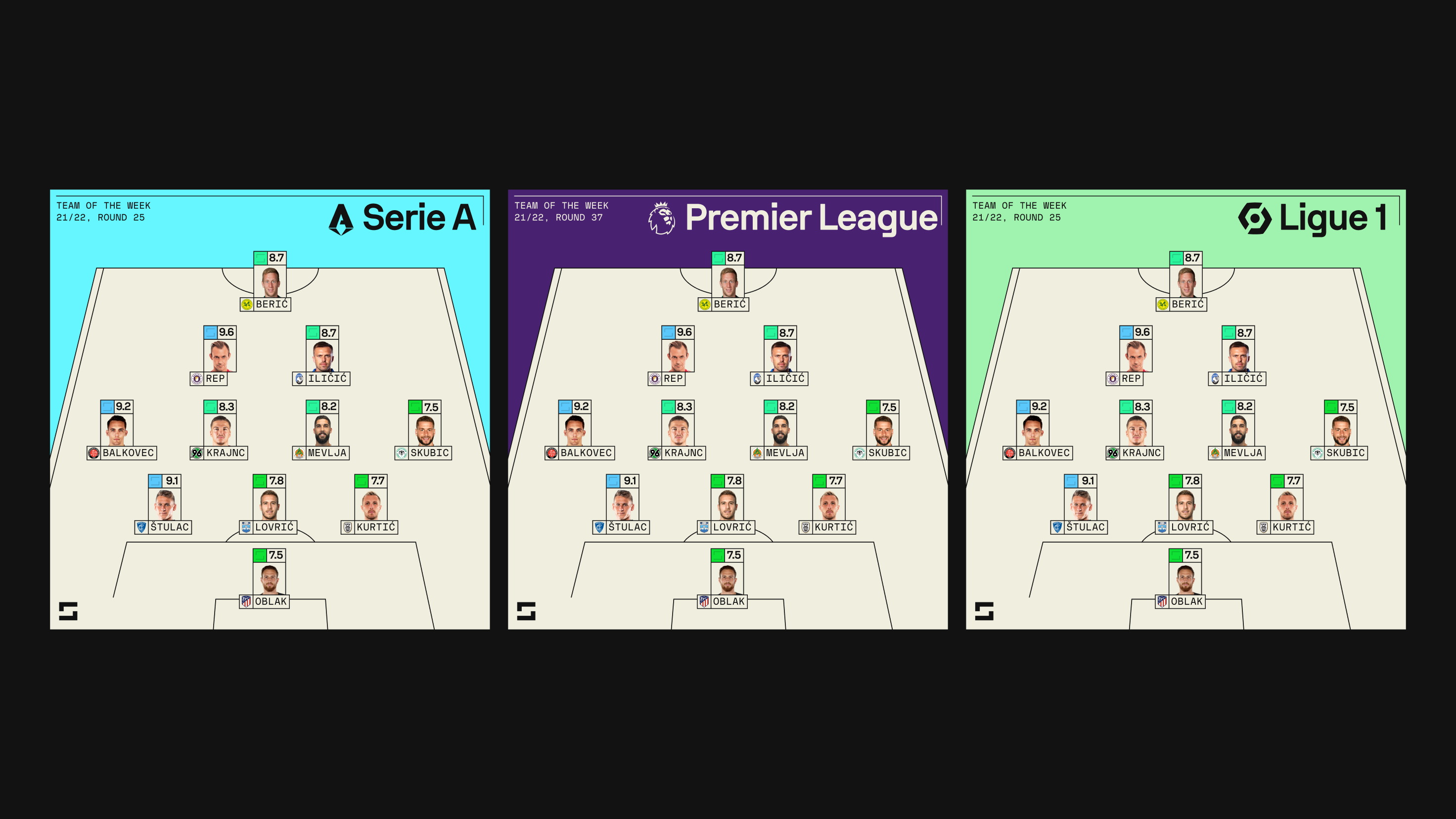
These allow for extreme versatility and they have a direct application on our adaptable team and player info graphics, as well as collaborations.
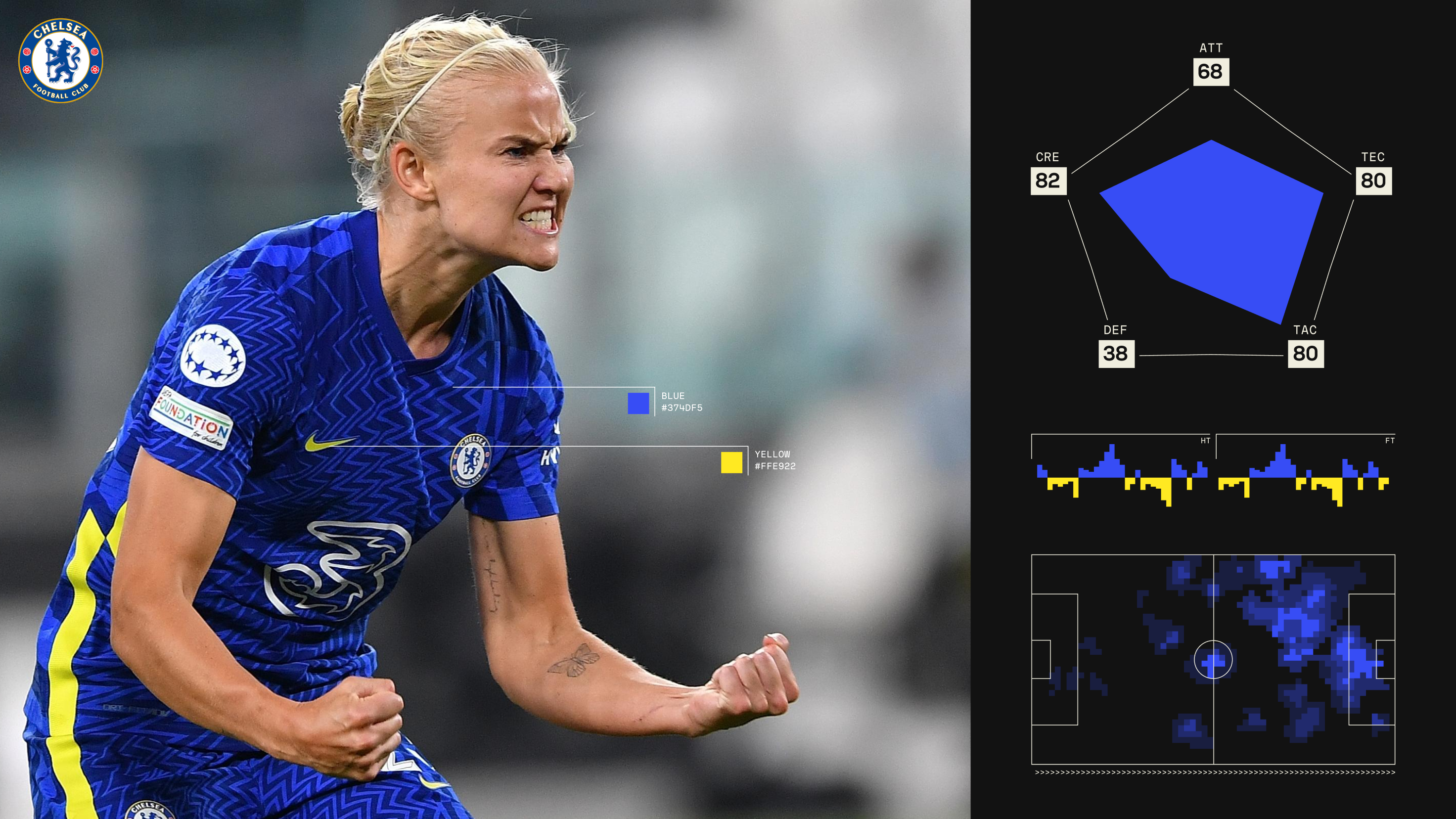
Team & player infographics
Colour match the team’s colour to the closest Sofa tertiary shade to create our custom Sofa graphic.
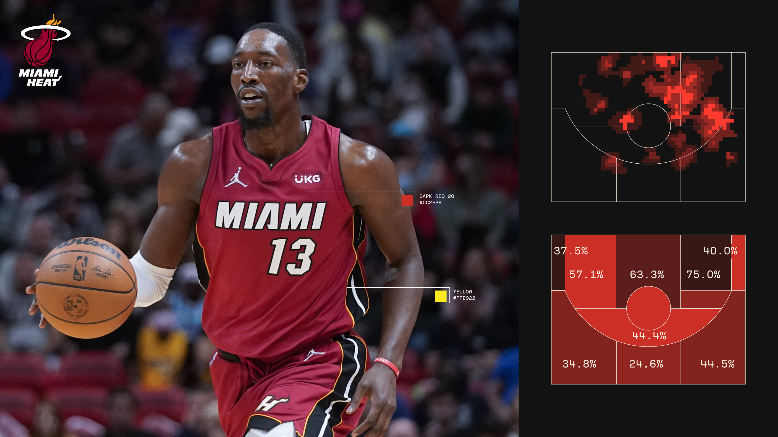
Collaborations
Colour match the team’s colour to the closest Sofa tertiary shade to create our custom Sofa graphic.