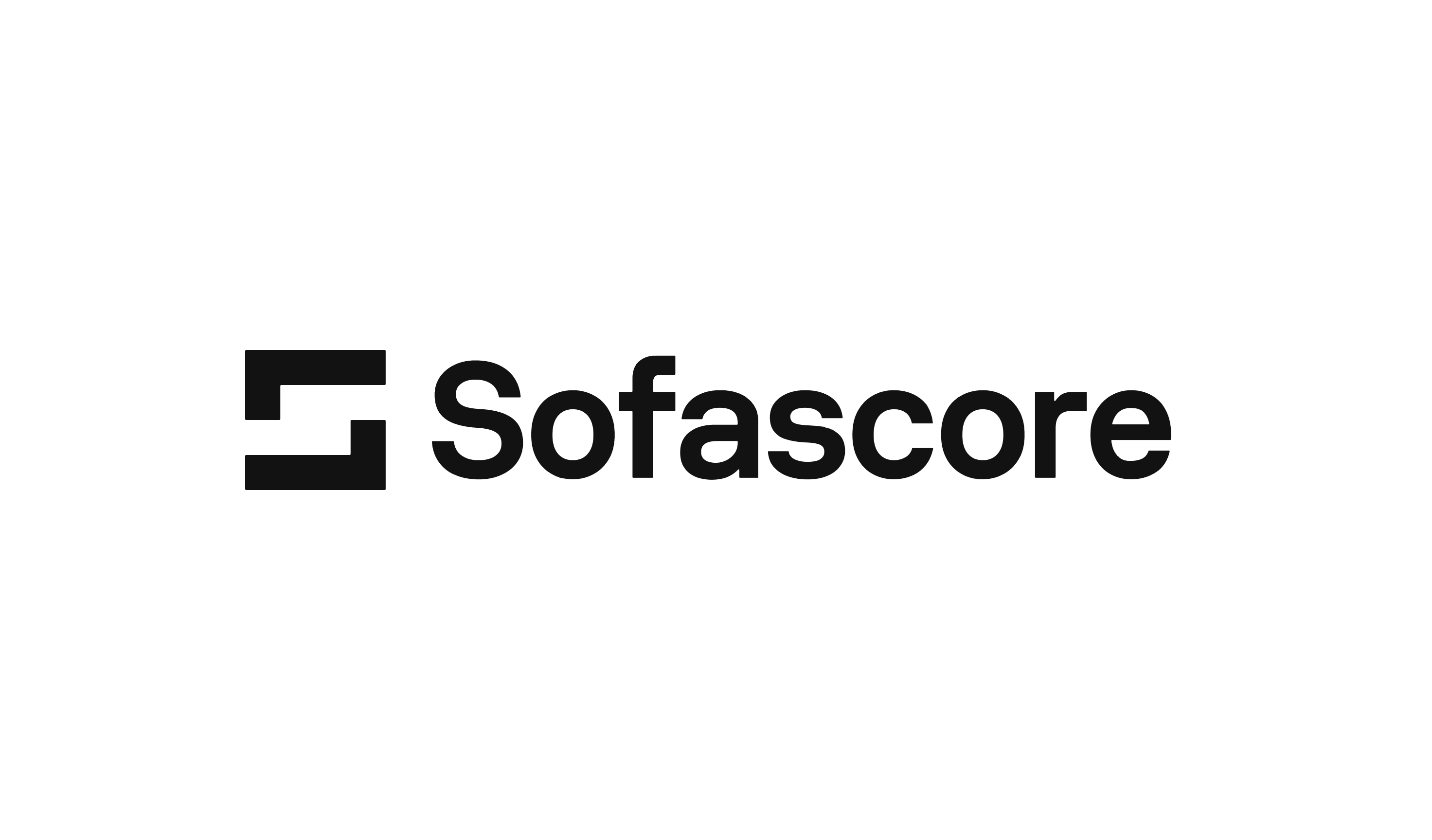
Logo
Logomark
01
Our logomark is at the center of our brand. Bold, minimal and abstract create a sense of timeless confidence.
Download
The two opposing frames represent Sofascore’s objective lense through which we analyse every sport through every angle. The two angles lock together to form the Sofascore ‘S’ mark.
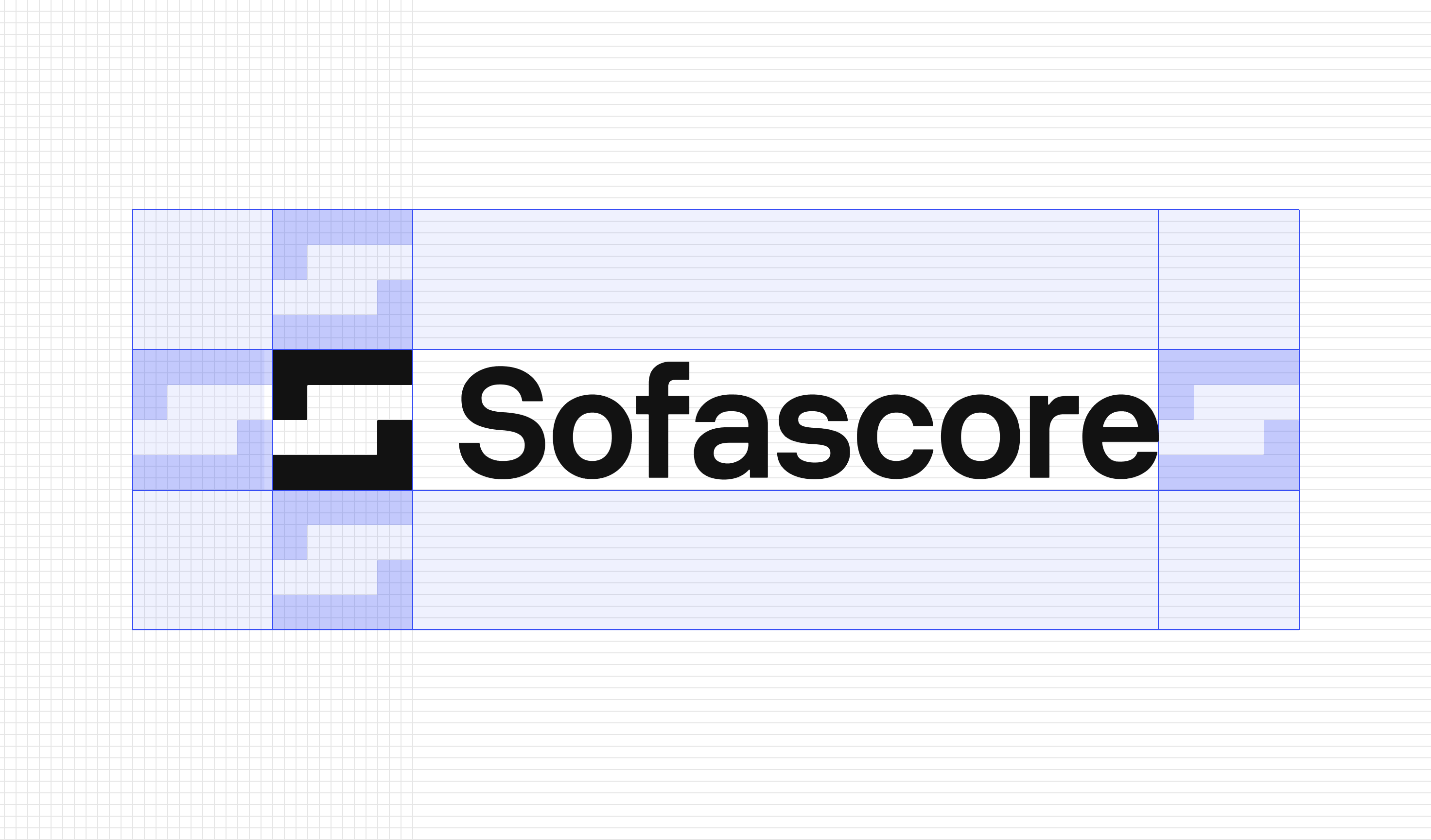
Clearance
The clear space defined helps keep other graphics at a safe distance. The diagrams show the correct amount of space that should surround the logomark when used on it’s own.
Minimum sizes
To ensure readability of the logomark it should not be used below these specified sizes.
Colour

Logotype
02
We add the Trademark symbol to provide an extra touch of power and balance.
Lockup
03
The two elements can also live alone when needed.
Clearance
The diagrams show the correct amount of space that should surround the lockup. Not accompanying text or logos should appear in this area.
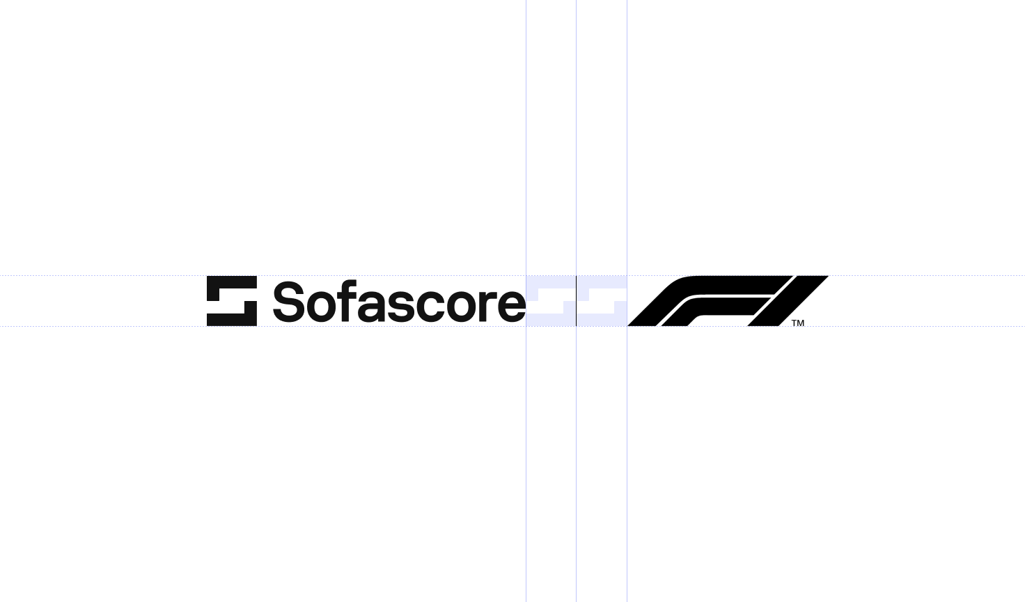
Partnerships
03
In a partnership or co-branding context, prioritise the use of the black & white version of the logos.
A vertical line can also be used to separate the logos between them in a structured way.