System

Grid
01
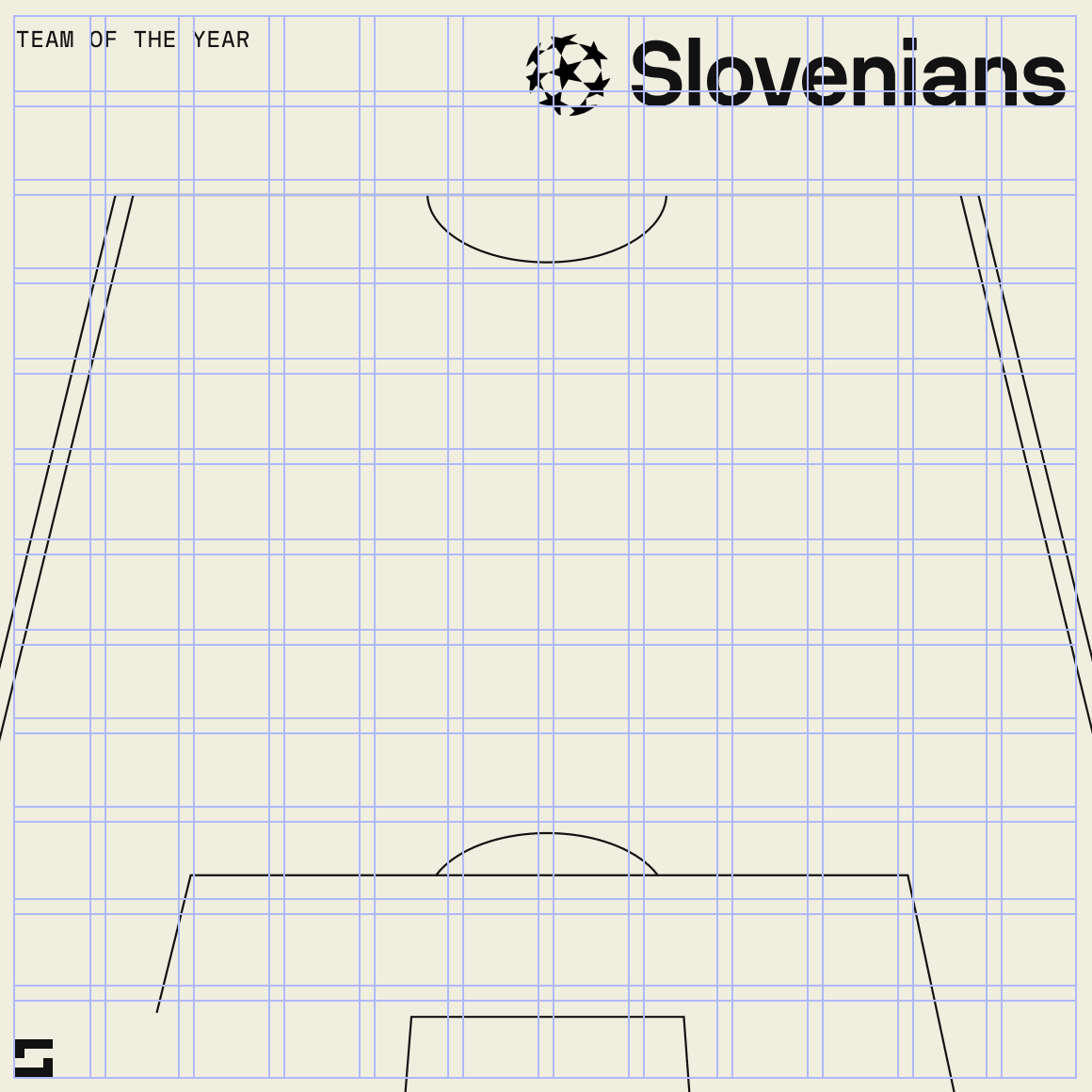
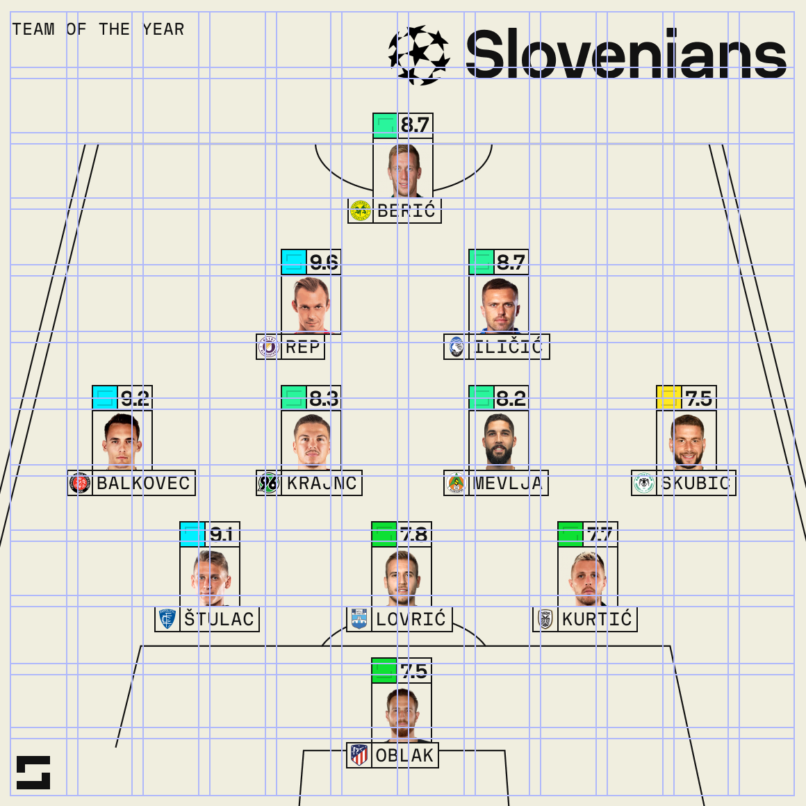
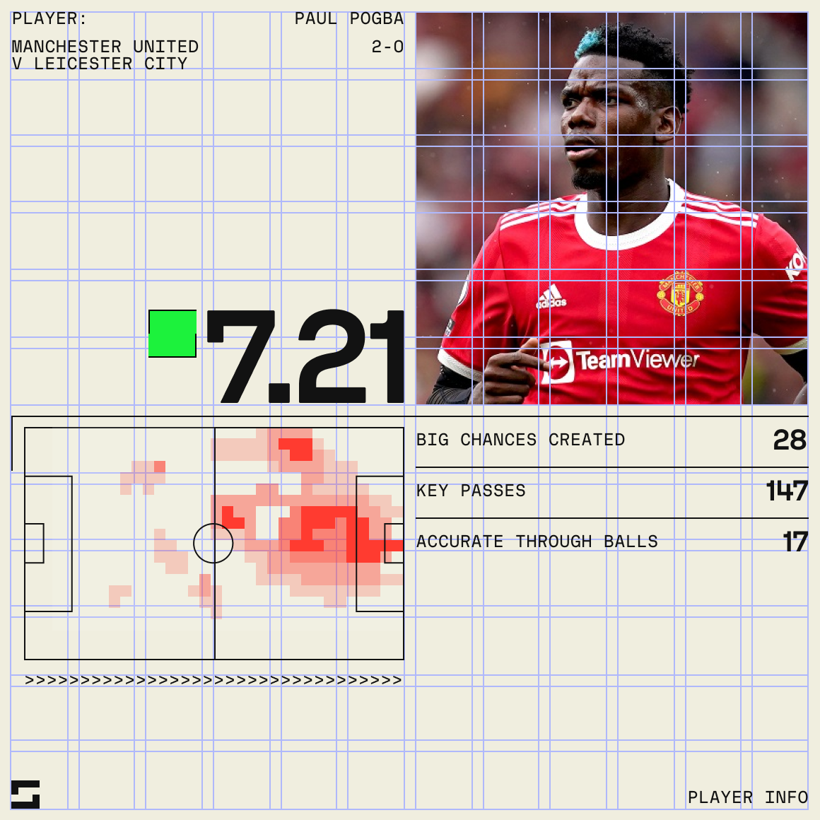
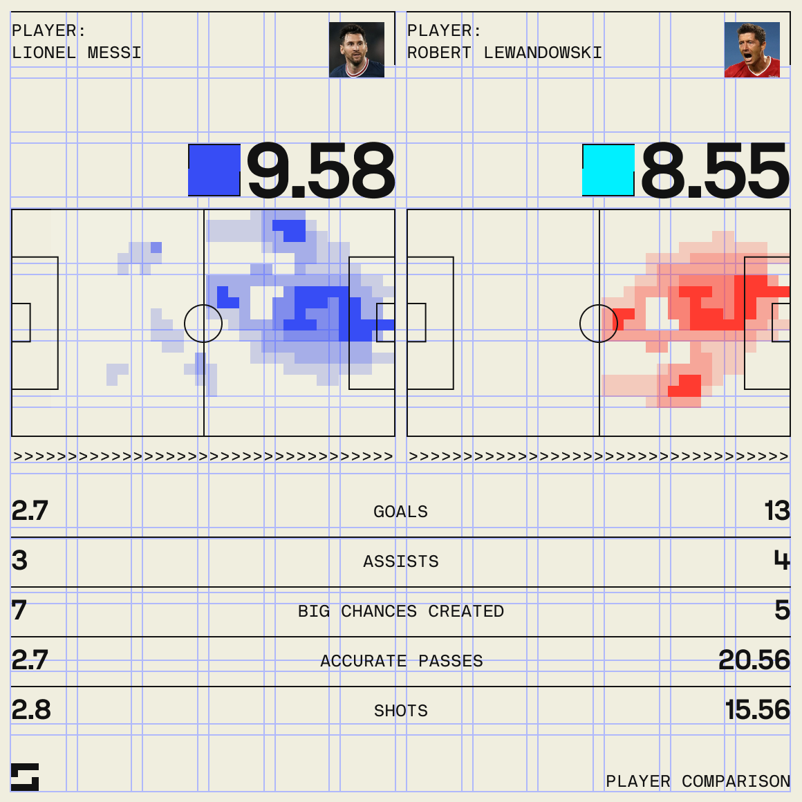
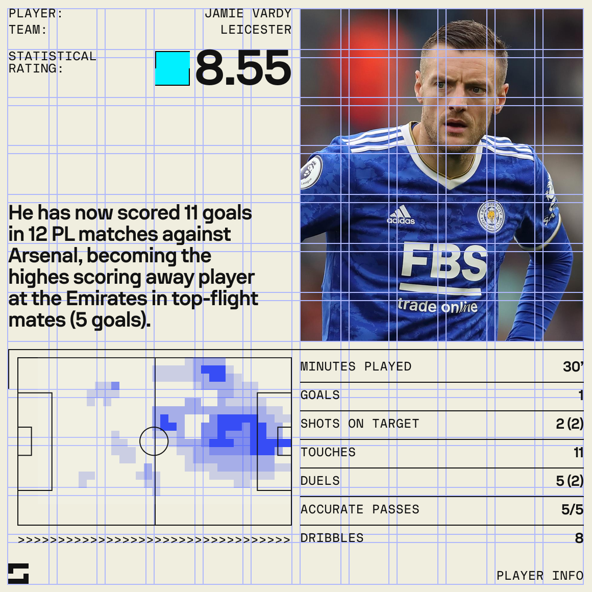
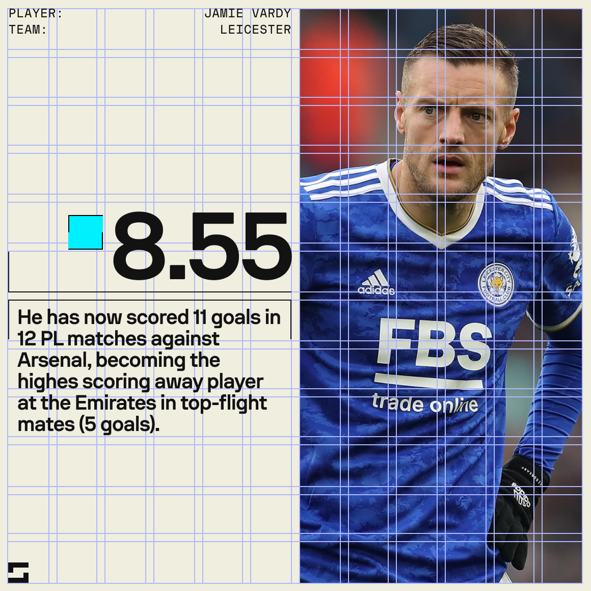
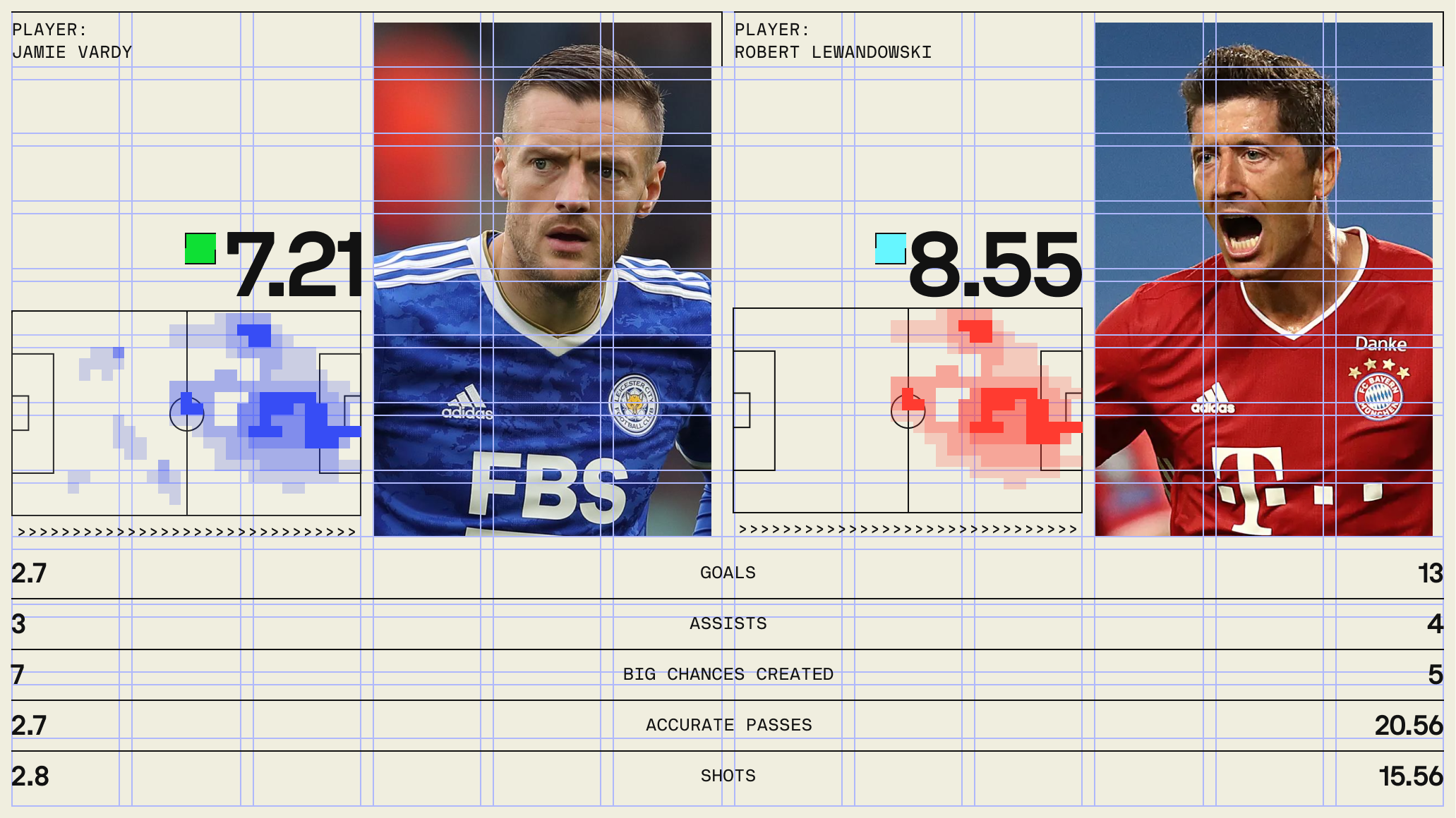
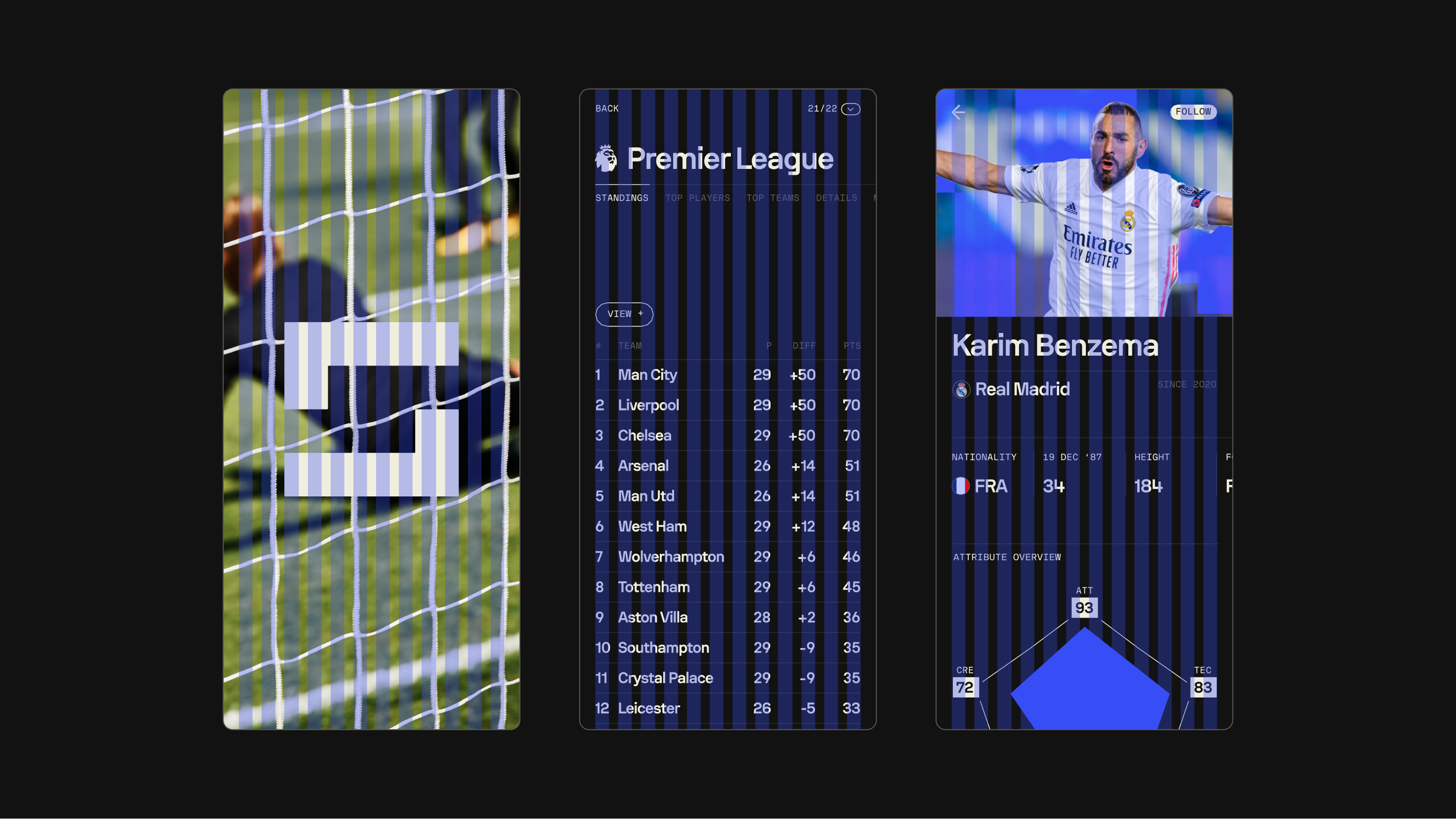
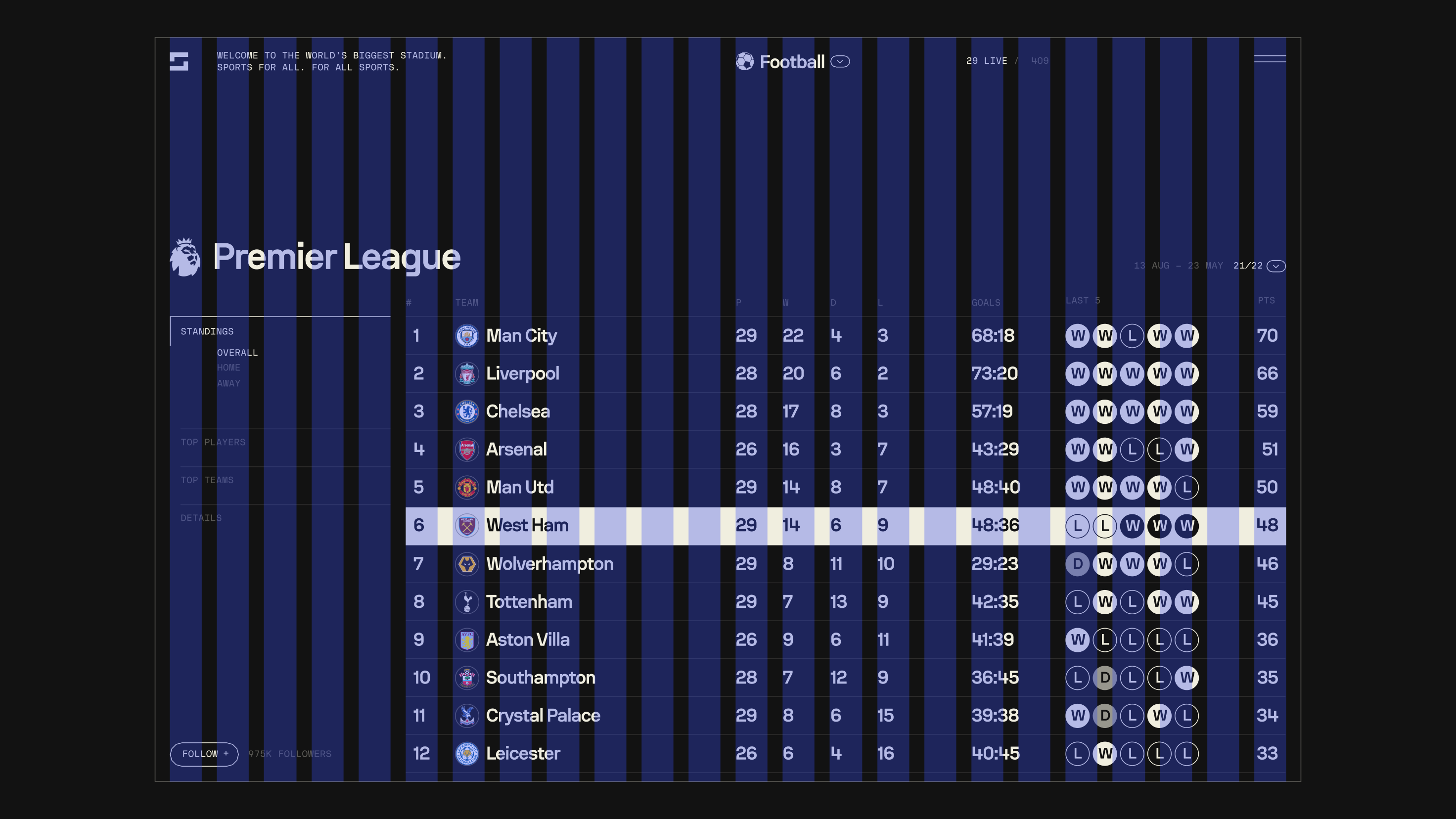
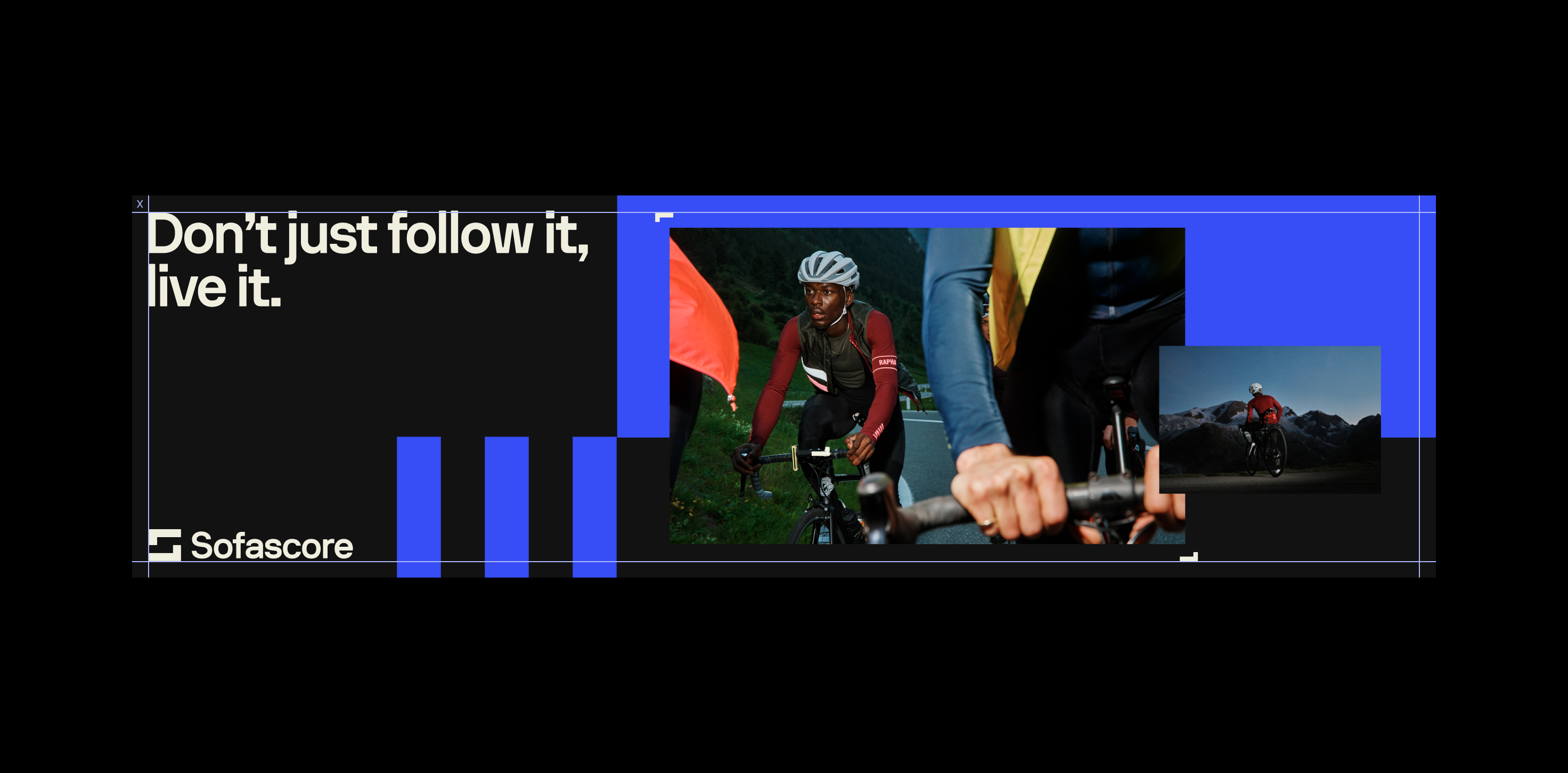
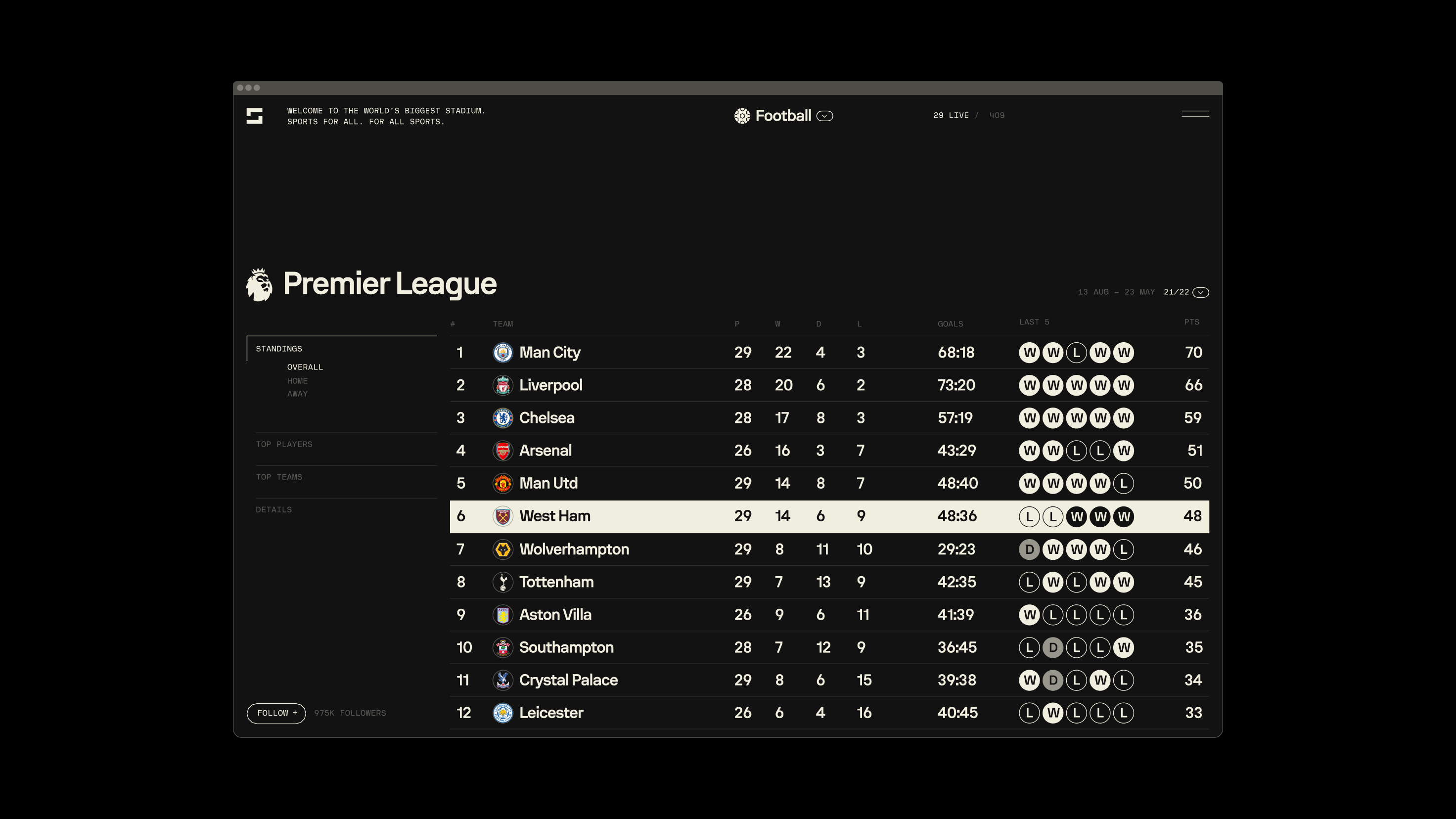
All of our layouts use the same method to create a neat and consistent outcome. Following a set grid is our starting point for every information we structure.
Following set grid allows us to gracefully scale our designs and create a consumable hierarchy.
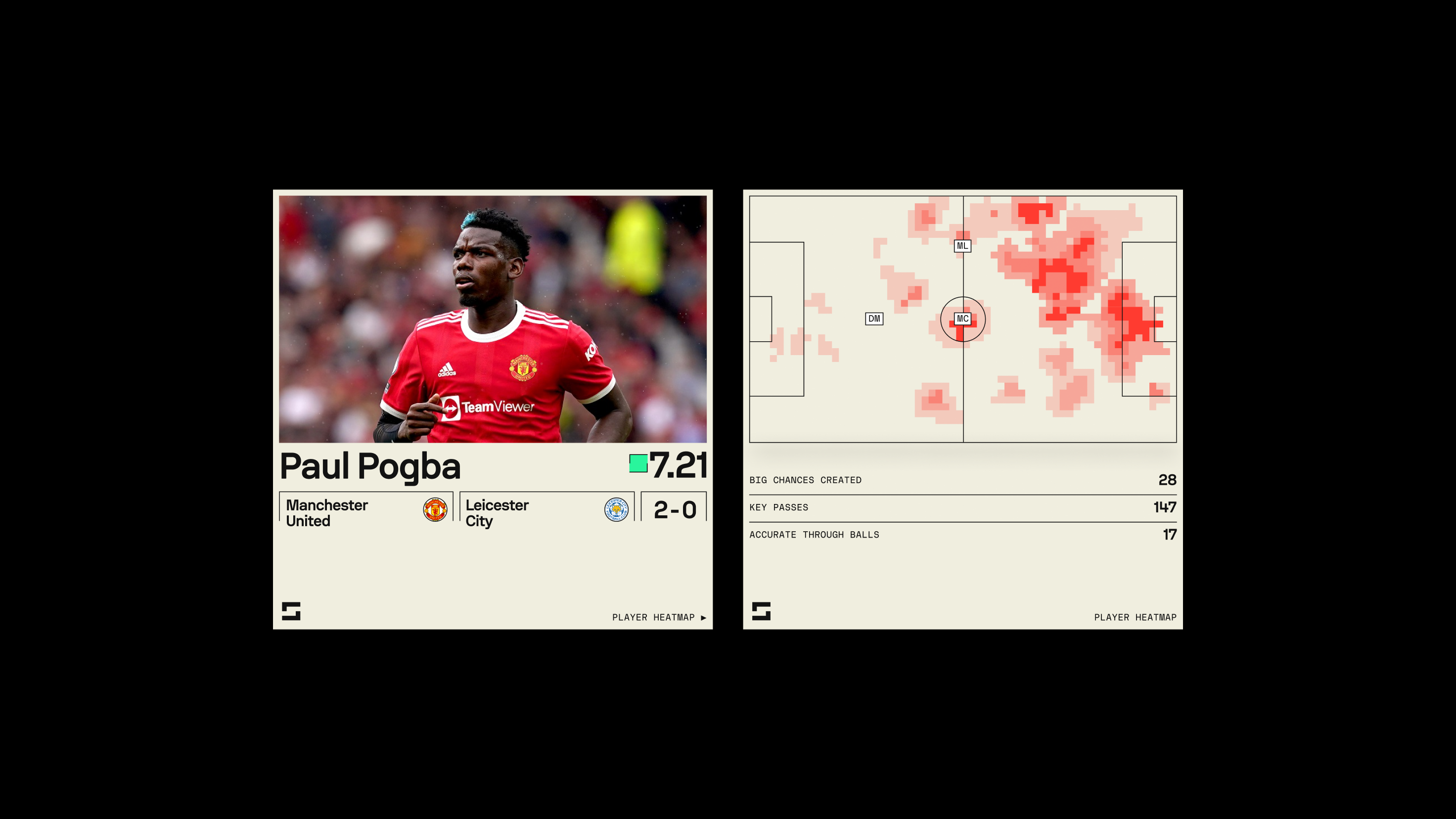
SOCIALS
columns12
rows12
typestretch
MARGIN8px
GUTTER8px
MOBILE & DESKTOP
MOBILE
columns12
typestretch
MARGIN20px
GUTTER12px
DESKTOP
columns24
typestretch
MARGIN20px
GUTTER12px
Type
02
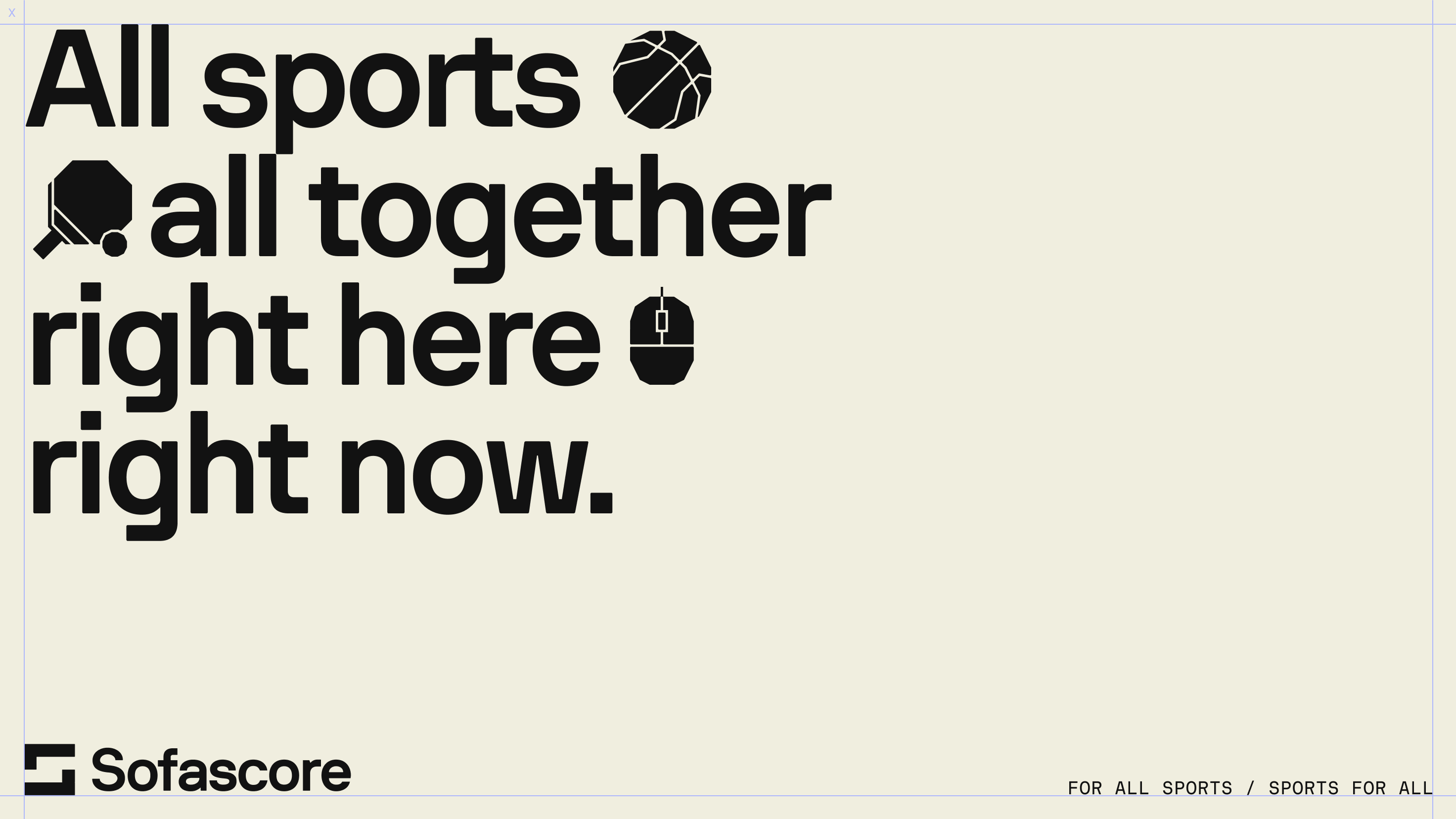
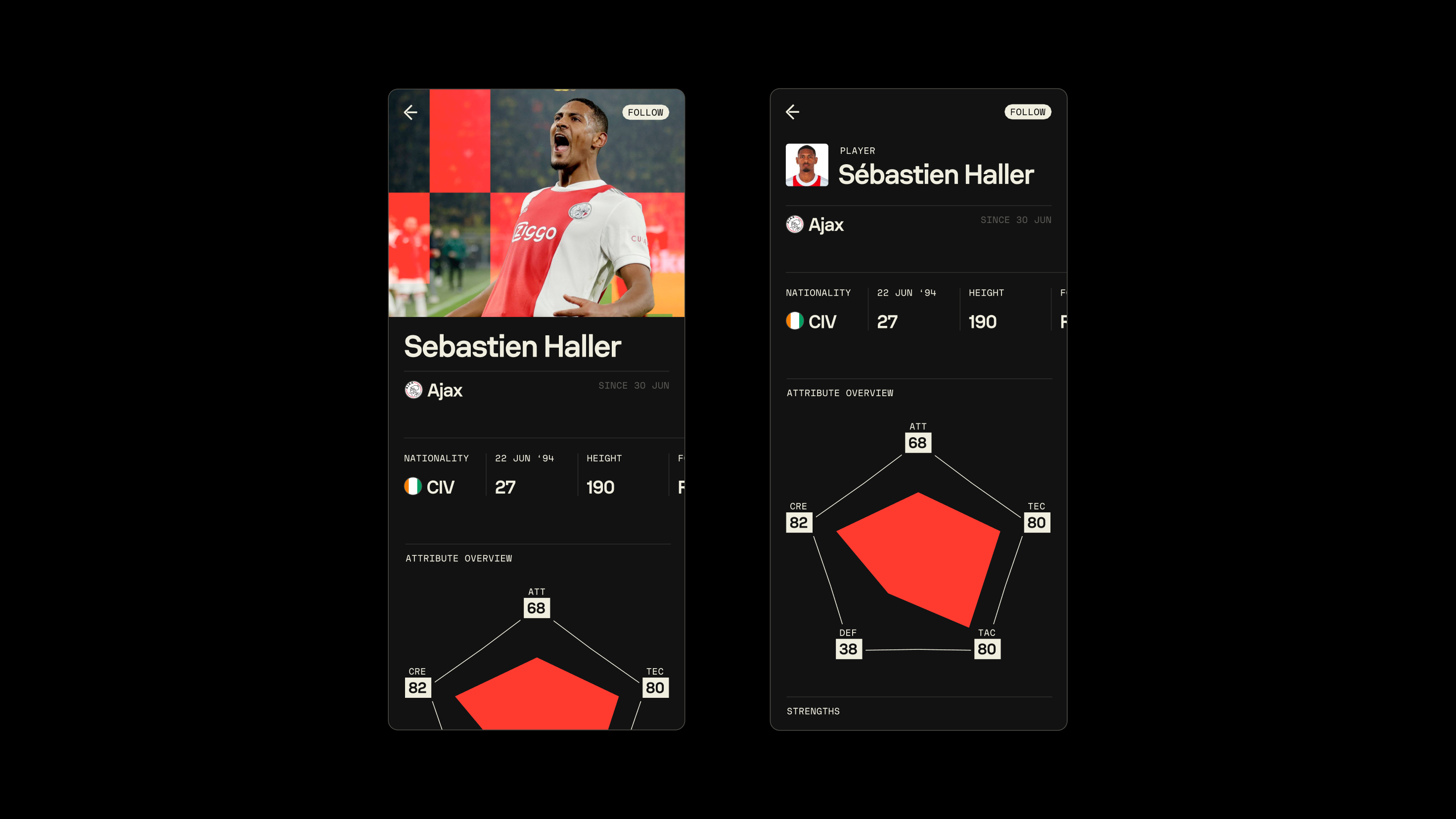
For the placement of our headline, sub-heading and logo we use a margin. Our margin (x) is workout out from our inner square within our S mark, please refer to clearance in logomark section.
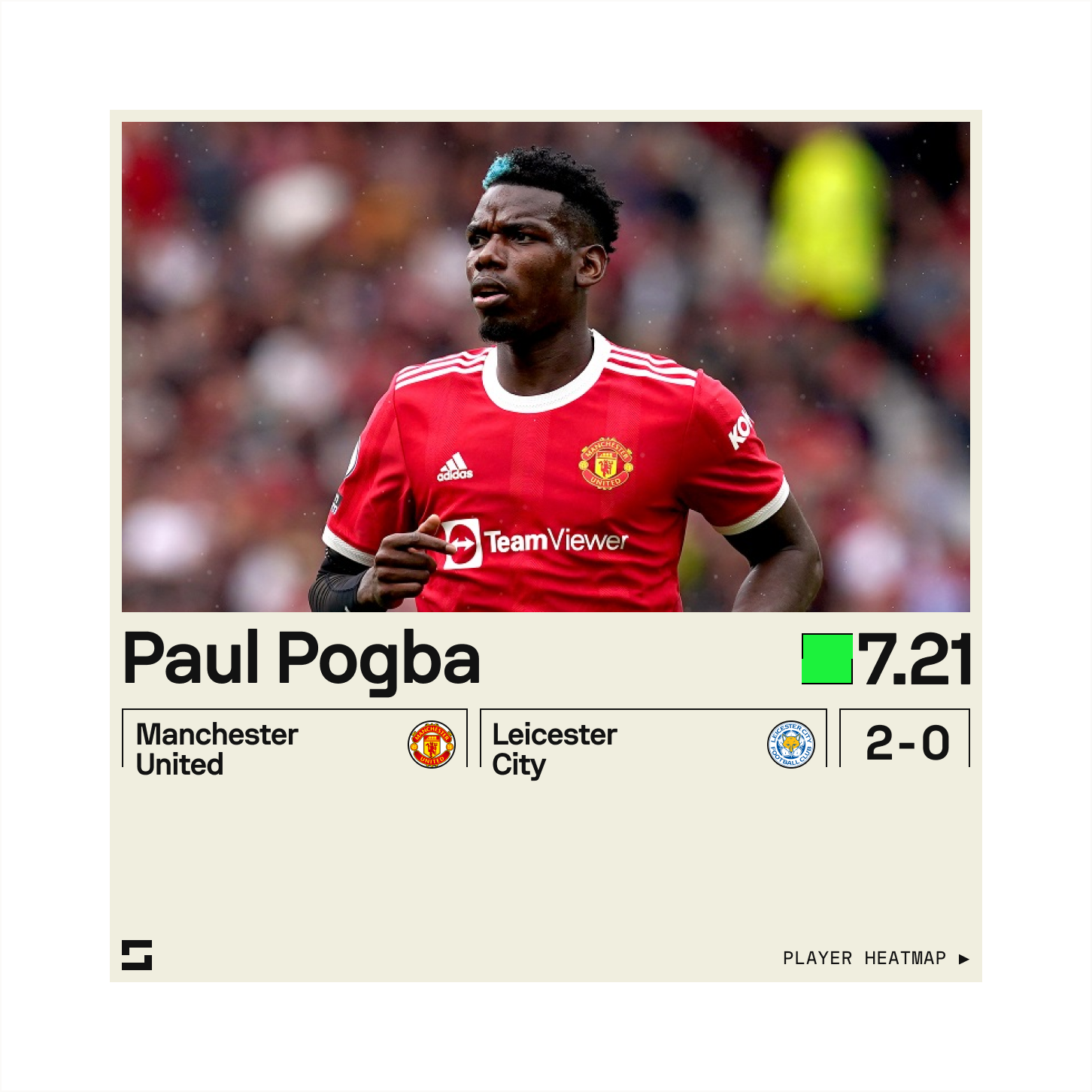
In most occasions the Hero copy will be left aligned with the Headline or Sub Heading aligned to it.
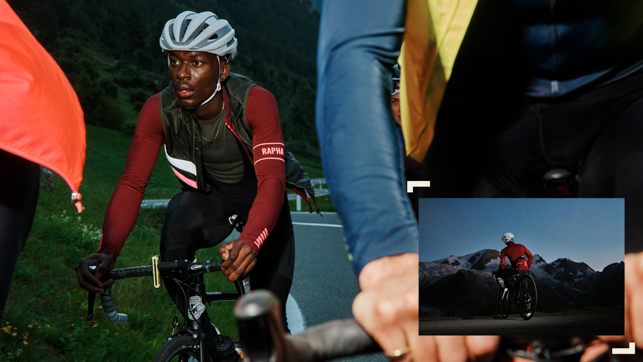
S Frame
03
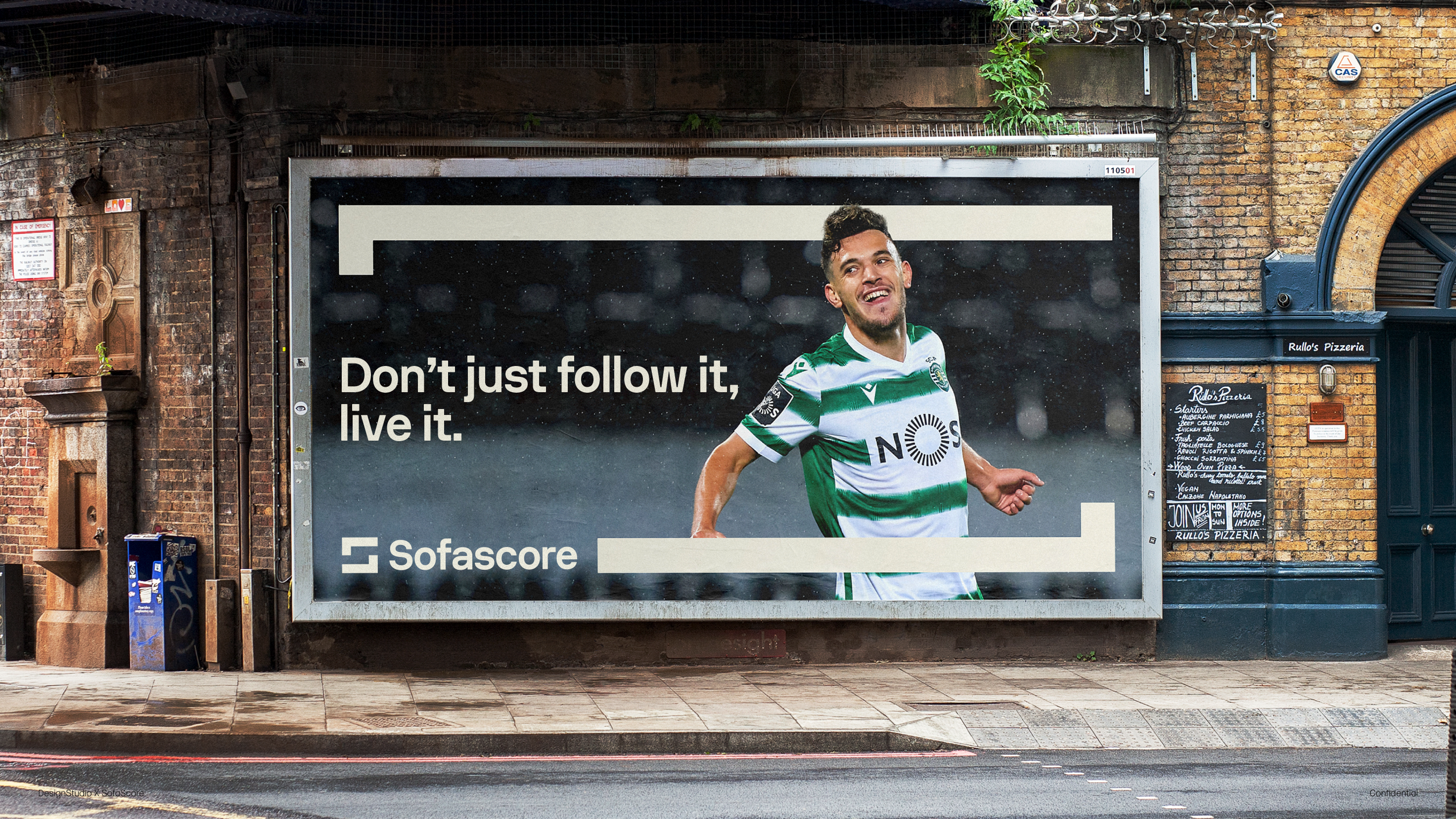
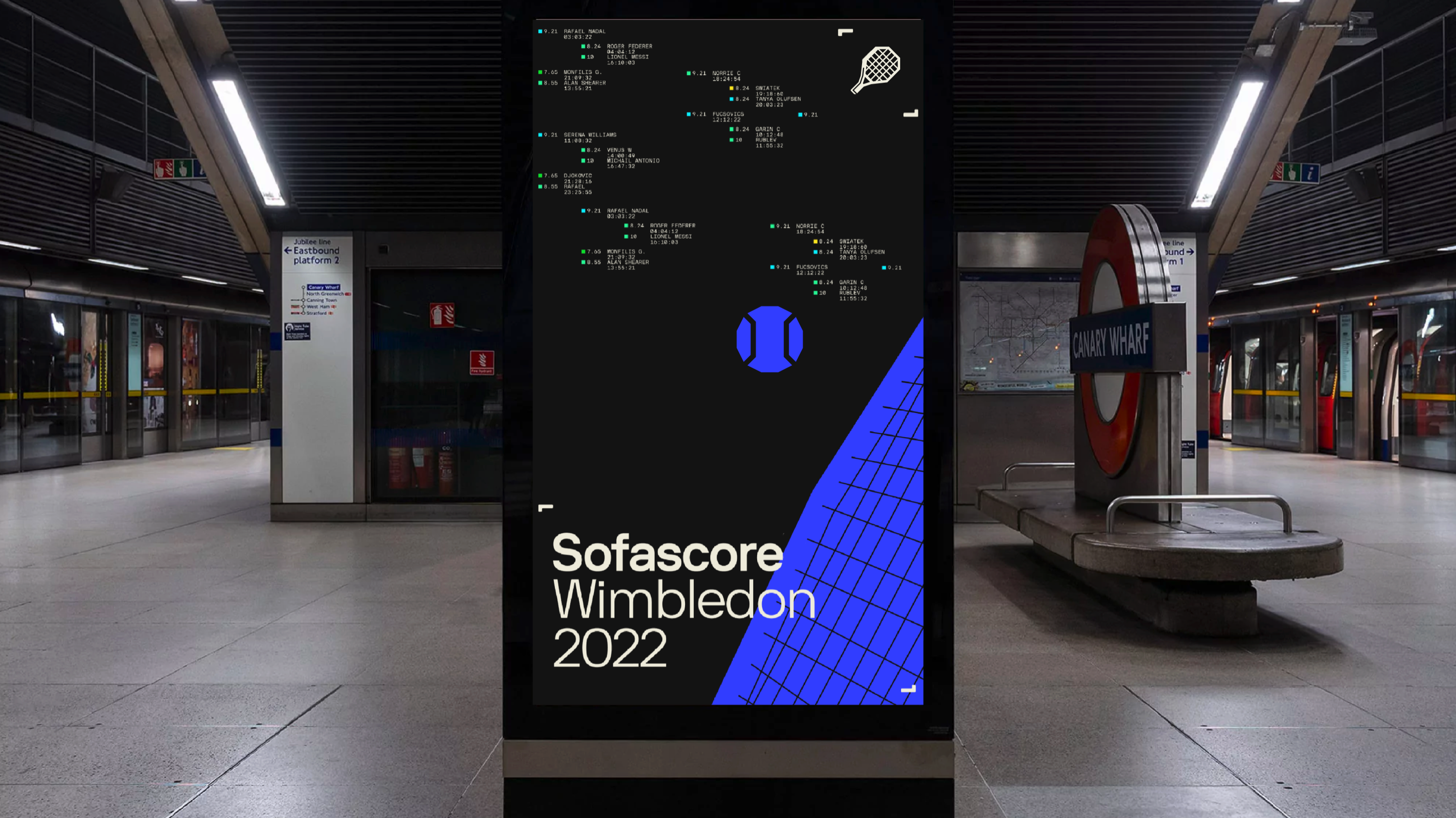
Our mark can be used to create distinctive brand moments. We flex the S frame in 3 different ways achieving an adaptable yet coherent language.
The mark extends to host, divide and interact with content.

FRAMING 01
SMALL
In its’ simplest form, the mark can divide and expand to frame all kinds of content within the inner space.

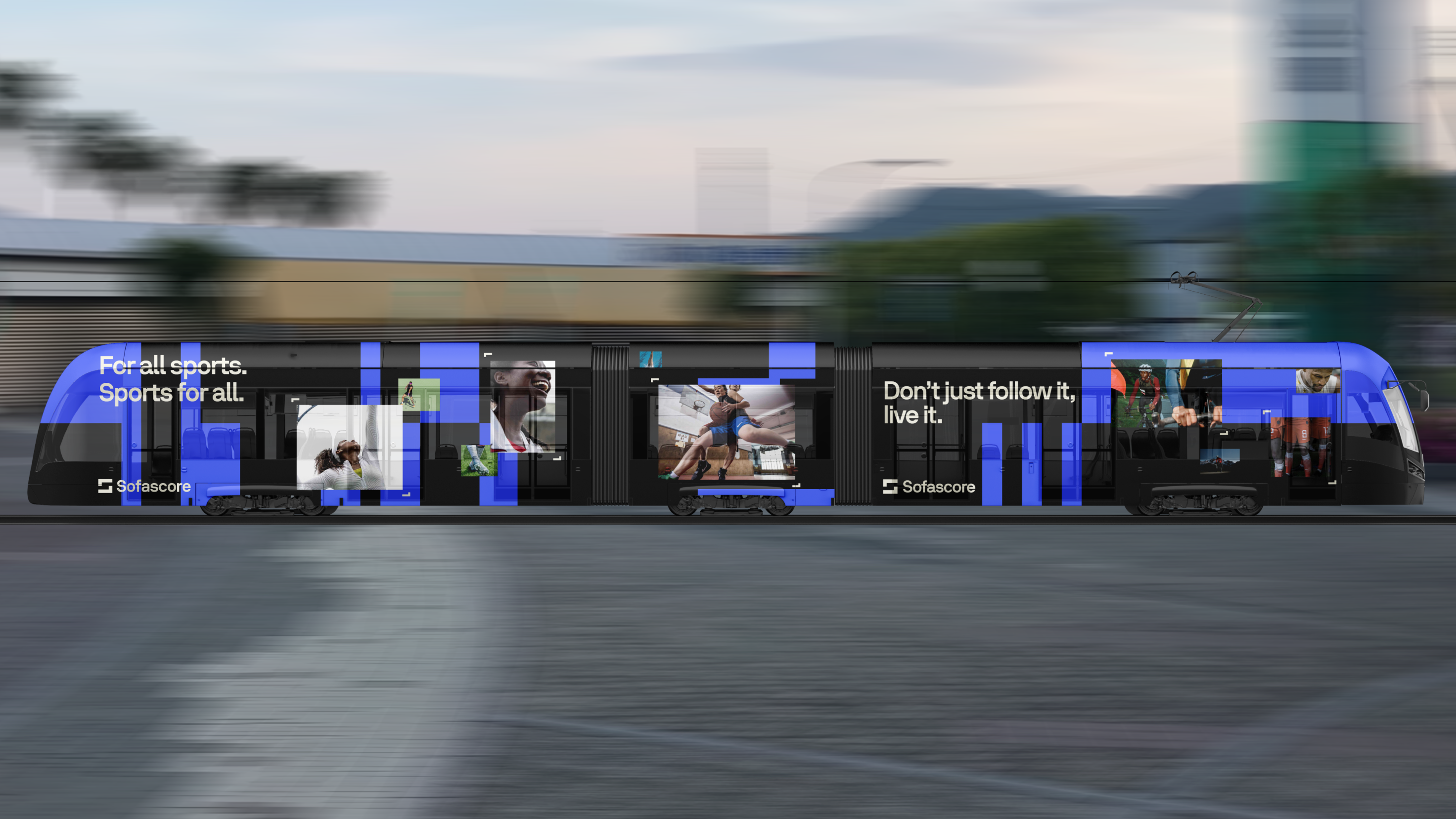
FRAMING 02
LIGHT
The mark can become lighter for a subtler or more functional use.

FRAMING 03
BOLD
Our boldest setting can be used to create eye-attracting impactful compositions.